Materials · 7 min · 1 November 2026
Leather Sofa Colours: Cognac, Chocolate, Black and the Rest
A leather colour is never just a colour: it changes with the light in the room, the floor beneath it and the wall behind it. Here is how to choose one you will still want in five years.
The short answer
Choose colour last, after the room and the leather grade are settled, and choose it from a physical swatch viewed against your own wall. Cognac and chocolate warm a room and hide the small marks of use; black and cream are graphic and unforgiving of both. Taupe and forest green sit between the two, and are the easiest to live with over time.
Colour is the decision buyers make first and regret most often, because it is the only one made from a photograph. A hide photographed in a studio in daylight, then viewed on a phone at night, is three removes from the colour that will arrive. The six colours in the collection are chosen to sit in real rooms rather than to photograph well, and the way to choose between them is to look at them where they will live.
1. The room decides the colour, not the other way round
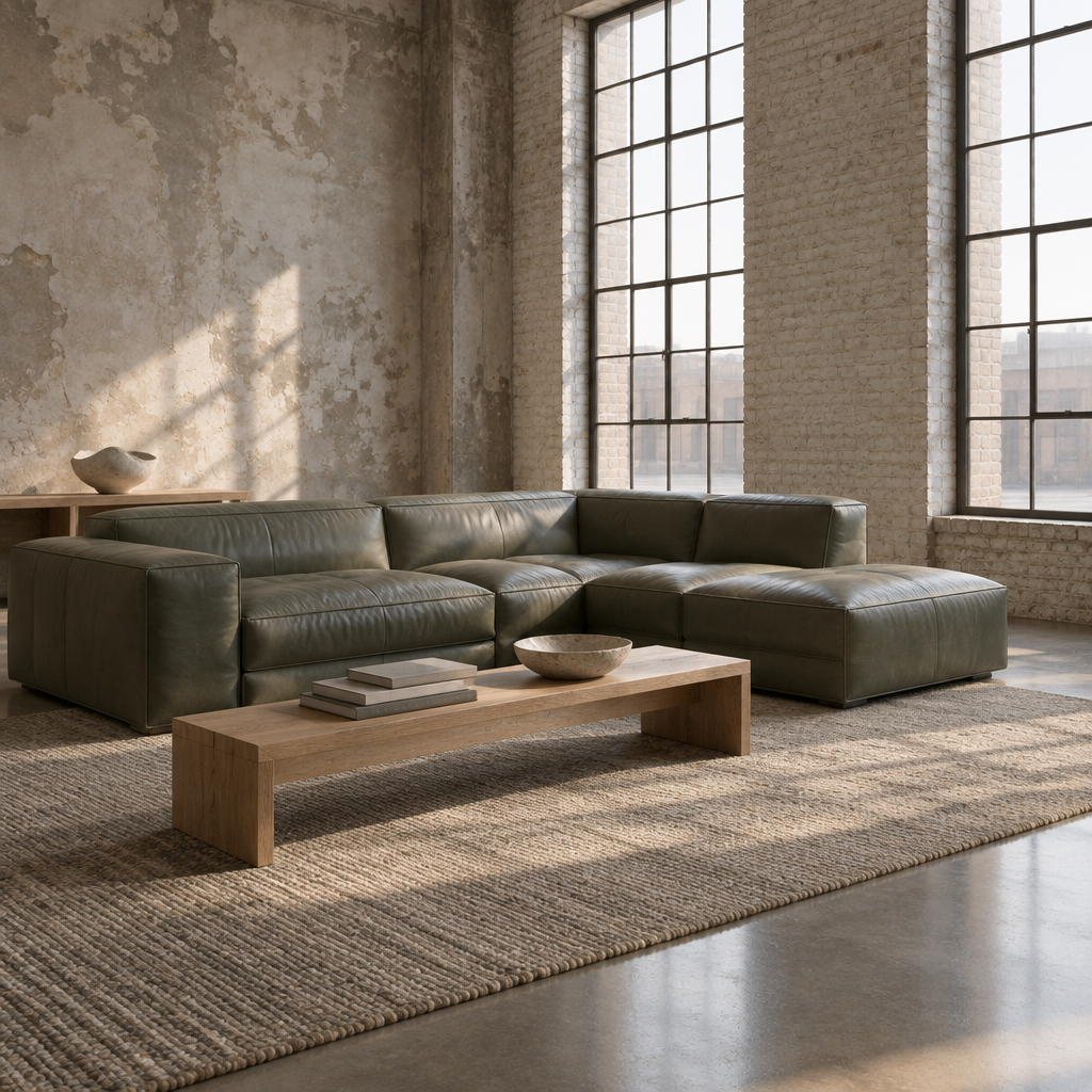
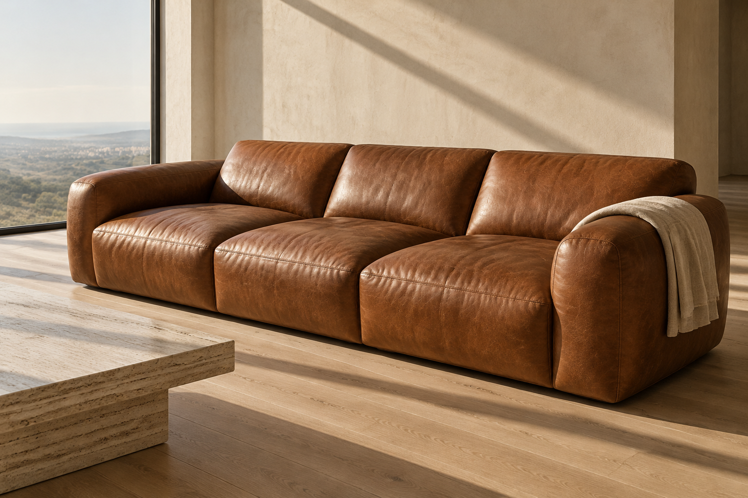
Before the swatch, look at three things: the direction the main window faces, the tone of the floor, and the colour of the largest wall. A room that takes its light from the north reads cool and slightly blue through most of the day; the same cognac in a south-facing room reads warmer and more orange. Oak and pale timber floors pull warm colours warmer. Grey concrete, dark timber and cool stone do the opposite, and a warm brown beside a cold grey floor looks more saturated than it did in the swatch pack.
This is why two people can order the same hide and describe it differently. Neither is wrong. The leather has not changed; the light around it has.
2. What each of the six does in a room
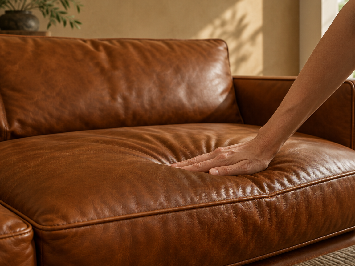
Cognac is the warmest of the browns, an open-toned mid-brown with an orange undertone. It lifts a dark room and sits comfortably beside pale plaster walls and both warm and grey timbers. It is the colour most people picture when they picture a leather sofa, and it is the one that changes most across the day.
Chocolate is the same family at the opposite end: deep, low in contrast, almost architectural. In a large room with good light it reads as a solid mass and makes the seating area feel deliberate. In a small room with one window it can absorb more light than expected, so it rewards a pale floor or a light wall behind it.
Black is the most graphic of the six. It draws the eye to the silhouette rather than the surface, which is why a low, deep sofa in black reads as a piece of furniture rather than a soft object. It shows dust and light-coloured pet hair more plainly than any other colour here, and it is the least forgiving of a room with hard, bright overhead light.
Taupe is a quiet stone neutral, warm-grey rather than beige. It is the colour that disappears most successfully, letting the form of the piece carry the room, and it works beside almost any wood or wall without arguing with either.
Cream is bone rather than white, with enough depth to avoid looking like a hotel room. It is the lightest option and the one that makes a space feel larger. It is also the one that asks the most of daily life, so consider it for a room that is not the main family room, and treat the seat cushions as the part that will age first.
Forest green is the only non-brown, non-neutral in the collection: muted, dark and cool-leaning. It is the most distinctive choice and the one that changes most with the finish, reading almost grey in flat light and clearly green in sunlight.
3. The undertone, not the name
Two browns can both be called brown and fight with each other across a room. The difference is the undertone: cognac leans red-orange, chocolate leans neutral to red, taupe leans grey. When you are choosing between two pieces in the same room, or between a sofa and an existing chair or floor, compare undertones rather than names. Warm tones sit beside warm tones; a cool grey beside a warm brown will always look like an accident.
4. How to test a swatch properly
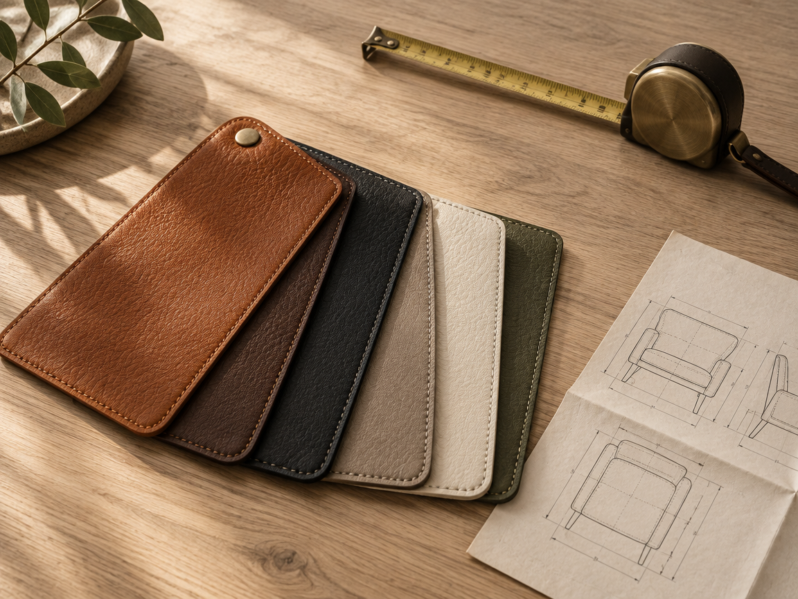
Hold the swatch against the wall it will sit in front of, not against the white of the page it arrived in. Look at it at three times of day: mid-morning, late afternoon and with the room's lights on in the evening. Warm bulbs push every colour here towards orange, and cool LEDs push them towards grey. Then lay it flat on the floor to compare it with the floor tone, because that is the comparison you will live with.
If you are still deciding after two days, the colour is close enough that the room will settle the question once it is in place. If one swatch has come out of the envelope repeatedly, that is the answer.
5. Colour and leather grade work together
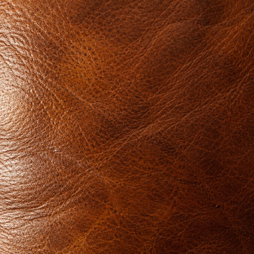
The same colour does not look identical across finishes. An open-pored aniline hide takes dye unevenly and reads deeper and more variable, with visible movement across a large surface. A pigmented hide reads flatter and more uniform, which suits the graphic colours such as black and cream and can make a warm brown look less alive. If a colour is the reason you are choosing a piece, ask which finish it is shown in before you commit.
6. Order the swatches first
Swatch packs exist because photographs cannot settle this. Ask for the colours you are considering, live with them in the room for a few days, and choose in the space rather than on the screen. It is the cheapest form of certainty in the whole purchase.
The complete buying guide
We send one email when we publish a new guide or add a piece to the collection. No frequency, no promotions.